
What Makes a Mylar Bag Design Stand Out on Shelves
- Mar 31
- 2 min read
Standing out on a shelf isn’t about being the loudest. It’s about being the most recognizable in a split second. When customers scan a row of products, their eyes don’t carefully analyze each one. They react to what feels clear, bold, and easy to process. That’s what makes certain designs stand out while others fade into the background.
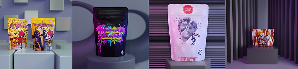
One of the biggest factors is clarity. A strong mylar bag design makes it immediately obvious what the product is and who it’s for. If the design is confusing or overly abstract, people tend to skip over it. Clear branding and a strong focal point usually perform better than overly complicated visuals.
Another factor is contrast. Designs that use strong differences between colors, text, and background tend to catch attention faster. High contrast makes important elements pop, while low contrast can make everything blend together. This becomes even more important in retail settings where lighting and distance can affect visibility.
Consistency also plays a role in standing out. Brands that use the same style across multiple products become easier to recognize over time. Even if someone doesn’t remember the name, they may remember the look. That familiarity can influence future buying decisions more than people realize.
Many businesses achieve this level of consistency by using custom mylar bags that are designed specifically for their brand. Instead of piecing together different styles, they create a unified look that carries across all their products. That kind of consistency helps build recognition and trust at the same time.
If you’re trying to create packaging that actually grabs attention, it helps to study what designs work best on mylar bags. Understanding what stands out visually can give you a much stronger starting point when designing your own packaging.


Comments