
How To Design Mylar Bags
- Nov 30, 2024
- 3 min read
Ever held a Mylar pouch and wondered what gives it such a polished, premium vibe? These sleek containers, known for their uncanny ability to preserve freshness, are much more than just pretty packages. Designing them isn’t rocket science—but it’s also not a paint-by-numbers task. If you want your product to shine on crowded shelves, you’ve got to infuse your packaging with both practicality and personality. So, how do you pull that off? Let’s dig deep into the process of how to design Mylar bags, step by colorful step.
Laying the Groundwork: Who Are You Designing For?
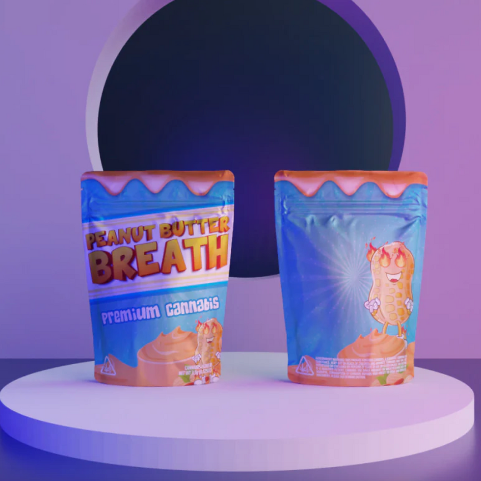
Picture your audience. Are they tech-savvy trendsetters? Nostalgic foodies? Cannabis connoisseurs? Whoever they are, their tastes (pun intended) should inform your choices.
Ask yourself this: What story do you want your bag to tell? Think about colors that speak a language of trust, fonts that whisper sophistication, and visuals that grab attention like a siren in the night.
Avoid being a chameleon. Consistency beats confusion. Stick to a brand identity that’s as rock-solid as a mountain.
Choosing a Bag Style That Speaks Volumes
Ever heard the phrase, “Form follows function”? That’s gospel truth in packaging design.
Flat pouches: Perfect for smaller items or single servings—think dried herbs or snack packs.
Stand-up bags: The workhorses of retail aisles, with enough sass to command attention. They’re sturdy, reliable, and totally Instagrammable.
Special finishes: Whether it’s matte sophistication or a glossy gleam, these touches can make your product look like a million bucks.
Injecting Artistry into the Design
Here’s where the magic happens. Design isn’t about slapping a logo onto a bag and calling it a day. It’s about weaving a visual narrative that sticks in people’s minds.
Images that pop: Sharp graphics that scream quality are a must. Blurry photos? A big no-no.
Typography with character: Choose fonts that marry legibility with personality. Avoid the curse of Comic Sans like the plague.
Color schemes that vibe: Choose tones that harmonize with your brand. A splash of metallics or pastels can add pizzazz without veering into gaudy territory.
When you design Mylar bags, remember: less is often more. Don’t drown your pouch in a tsunami of cluttered text and visuals.
Practical Flourishes: It’s Not Just Pretty
Let’s face it—nobody likes a package that’s all beauty but no brains. Make sure your design doesn’t skimp on usability.
Clear windows: Transparency sells, literally. People love seeing what they’re buying before they open it.
Seals that work: A resealable zipper might seem like a minor detail, but trust me, it’s a game-changer. Convenience speaks volumes.
Compliance details: Sneak these into your design without making your bag look like a legal document.
Printing That Brings It All to Life
Your design, no matter how dazzling, needs the right medium to thrive. Printing transforms your concept into a tactile reality.
Digital printing: Best for short runs and intricate patterns. It’s nimble and forgiving.
Flexographic printing: Great for when you need thousands of bags without draining your wallet.
Rotogravure printing: A pricier option, but the quality? Chef’s kiss.
Test, Tweak, Triumph
This step is where you separate the amateurs from the pros. Before you roll out your design for the world to see, give it a test drive.
Feedback that counts: Share prototypes with real humans (not just your mom, unless she’s brutally honest).
Tinker and refine: Colors might not pop as expected. A font might look too busy. Fix what feels off until you’ve got a design that makes you grin.
Final Thoughts (Or Are They?)
Designing Mylar bags is part science, part art, and a sprinkle of intuition. Approach it like a recipe: a dash of creativity, a pinch of technical know-how, and a whole lot of love for your brand. When you design Mylar bags with intention and flair, they become more than just packaging—they become an experience. And isn’t that what great design is all about?


Comments