
18 Tips for Designing Custom Printed Mylar Bags Like a Pro
- Aug 26, 2025
- 4 min read
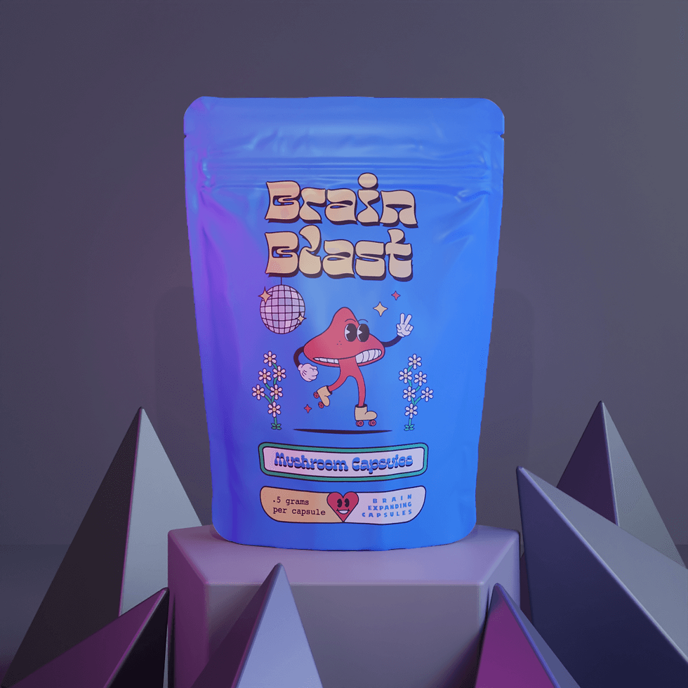
Custom-printed Mylar bags? They’re not just packaging, honestly, they’re little sales hustlers doing your job before you even show up. These things sit on shelves, scroll through a hundred online carts, and basically flirt with shoppers before anyone tears them open. If you want your bag to go from “meh, whatever” to “oh, grab THAT one,” you gotta mix a little brain science, some marketing magic, and maybe a sprinkle of art school. Buckle up, here’s 18 down-and-dirty tips to get your Mylar bags working overtime.
1. Let Your Brand Story Spill Out
Don’t just slap a logo on and call it a day. Every color, font, squiggle, or doodle should scream something about who you are. Seriously, bags with a real vibe are way more memorable; like, 30% more, according to the marketing nerds.
2. Keep It Stupid Simple
Designers love to go nuts with graphics and tiny text. Don’t. Clean, minimal designs are like a deep breath for your eyeballs. White space is your friend, it makes the important stuff pop.
3. Level Up Your Fonts
Fonts are sneaky powerful. Want to look edgy? Go with a chunky sans serif. Feeling old-school? Serif all the way. Some study said the right font can make people think your product’s 60% fancier. Wild, right?
4. Show Off the Features
Mylar bags aren’t just pretty faces; they’re tough. If your bag’s got a zippy seal, cool gussets, or a tear notch, make it obvious. Little icons or simple doodles work way better than a wall of text.
5. Play With Color Psychology
Color hits harder than words, no joke. Red makes people hungry. Blue chills them out. Gold? Total luxury vibes. Get this.. 85% of shoppers say color’s why they pick stuff up in the first place.
6. Make That Logo Loud
Your logo shouldn’t hide in the corner like it’s embarrassed. Plaster it front and center. Consistency here means 80% better brand recall, or so the stats say.
7. Texture = Instant Fancy
Matte, shiny foil, weirdly soft finishes; these aren’t just for show. Weird textures make people think your product’s worth more. One study said it bumps value by 25%. Who doesn’t want that?
8. Let People Peek
Windows or see-through bits? People LOVE to spy on what’s inside. Transparent packaging makes shoppers 30% more likely to actually buy because, duh. they know what they’re getting.
9. Stand Out on the Shelf
Picture your bag stuck between a sea of copycats. You gotta pop. Use wild shapes, big contrast, or flip the layout vertical. Nielsen says funky packaging gets 41% more eyeballs.
10. E-Commerce Ready
Not everyone shops in person. Online, tiny details get lost. Go bold with colors, chunky fonts, and simple layouts that still look awesome as a thumbnail.
11. Add Some Smart Labels
QR codes, batch numbers, secret links; these are more than just geeky add-ons. Turns out, 70% of folks will scan a code if there’s a cool payoff (like a recipe, video, or proof it’s legit).
12. Info vs. Looks: Find the Sweet Spot
Yeah, you gotta put nutrition facts or warnings and stuff. Just don’t let it take over the design. The pros know how to sneak in all that legal mumbo-jumbo without making it ugly.
13. Think Big (And Small)
Your tiny 3.5x5" pouch might turn into a one-pound beast later. Design stuff that scales, makes your brand look consistent no matter what size it is.
14. Master the “Golden Zone”
There’s a ‘sweet spot’ about a third down from the top.. that’s where eyes naturally land. Stick your logo or the big message there for max impact. Science, baby.
15. Test with Actual Humans
Stop designing in a bubble. Even the big dogs show mockups to real people before launch. Here’s a wild stat: 72% of flopped products didn’t bother testing their packaging with actual buyers. Don’t be that guy.
16. Printing; It’s Not Magic
Listen, your average printer isn’t some wizard who can conjure up every wild effect you dream up. Super fancy gradients? Metallic shenanigans? Sometimes, it just ain’t happening. The pros? They talk to their printers early on.. saves a ton of cash and a big ol’ headache down the road.
17. The Back of the Bag: Underrated MVP
Everyone’s obsessed with the front, but the back? That’s where the fun lives. Toss in a cheeky joke, a weird doodle, or a mini origin story; whatever shows off your brand’s weirdo side. And get this: more than half of shoppers (yeah, 52%) actually flip the bag over just to see what’s hiding back there.
18. Don’t Go It Alone If You Don’t Have To
Nobody expects you to become a packaging Picasso overnight. There are legit companies like Brandmydispo who literally do this for a living. You team up, they bring the pro templates and shiny finishes, and suddenly your bags look like they belong on some fancy boutique shelf.
Wrapping It Up
Look, designing killer Mylar bags is part science, part art, part “let’s see what happens if we do this.” It’s not about just making something that looks kinda cool. it’s about creating a vibe people remember when they’re munching snacks at midnight. Keep these tips handy, experiment like a mad scientist, and don’t be scared to get weird with it. That’s where the magic happens.
Customize your own mylar bags here: https://www.brandmydispo.com/collections/custommylarbags


Comments